read case study
BearingPoint - Client Consumer Goods

Unification in SAP UX

Composition of multiple parts of SAP Fiori interfaces

my role

UX Design Consultant

overview

BearingPoint collaborates with SAP to enhance user experience (UX) by integrating modern tools like SAP Fiori, improving efficiency and usability across enterprise applications. The approach focuses on leveraging SAP’s capabilities to streamline workflows, reduce complexity and elevate the overall digital transformation journey for businesses.
A client was undergoing a comprehensive digital transformation project, where the unification of multiple disparate interfaces into a cohesive SAP Fiori application tailored for an Accounts Receivable Persona in the business of Repair in the consumer industry was needed.
This involved conducting user research workshops, developing low-fidelity and high-fidelity prototypes and visualizing data through interactive dashboards, ultimately leading to an enhanced user experience and streamlined business processes.

timeline & status

2019/ 2020 - 8 months

applied skills

UX Research
UX Design, User Flow Design
UI Design, Rapid Prototyping
Data Visualization

industry

Consulting
Consumer Goods

outcome

The project resulted in a unified SAP Fiori application that improved task completion time by 65%, reduced user errors, and significantly boosted task-level satisfaction among stakeholders.
DISCLAIMER: Due to the project's Non-Disclosure Agreement (NDA), the designs have been altered to protect the client's business interests.
01

context

custom design for user satisfaction

The standard does not fit to custom requirements

The fragmented nature of the existing Accounts Receivable/Repair process interfaces as well as the specific requirements from stakeholders and customers justified the need for an overhaul of the existing customer-facing UI. A custom solution that targets needs of all stakeholder was to be build on SAP UX.
Customer

Accountant

No unified repair process available with one unified UI. I need to switch tools constantly to get my work done.
Customer

Manager repair process

Customer satisfaction is very low, since access points for starting a repair process are not harmonized, leading to confusion and multiple sessions to be opened for the same process to be finished.
Customer

Accountant Clerk

No overview of what I actually need to do, so it takes a long time to actually do what I should. 
02

my problem

confusion and inefficiency

Impossible to navigate multiple interfaces for one task

Inconsistent design patterns hindered the ability to complete everyday tasks seamlessly for the Accounts Receivable/Repair process, leading to reduced productivity and lowered user satisfaction.

Two interfaces with complementary features

The main design problem was the lack of a unified user interface for the Accounts Receivable/Repair process, leading to inefficiencies and user frustration. Users had to navigate multiple interfaces, retain information temporarily, and manually transfer data between systems.
This disjointed experience not only slowed down the process but also increased the likelihood of errors.
Old ERP system
03

my approach

step-by-step forward

Solving the design problem

From Requirement analysis over user research, prototyping with several iteration towards usability testing, a full user-centered design approach has been taken in to consult the client and solve the design problem.

Iterative Designing

The design approach for the SAP Fiori application involved a meticulous, iterative process aimed at addressing the identified problems and achieving a unified user interface. It can be shown that this continuous iteration and the strong focus on Lo-Fi prototypes upfront helped to get simple requirements to a robust design solution.

Stage 1: Requirement analysis

The project began with an in-depth requirement analysis involving multiple business stakeholders. This stage was critical to understand the specific needs, pain points, and expectations from the new Fiori application. Despite the challenge of coordinating with numerous stakeholders, their insights were invaluable in shaping the initial design direction.
Empathy map of Persona 1
Empathy map of Persona 2

Stage 2: User research and interviews

Following the requirement analysis, user research was conducted through focus groups and one-on-one interviews with internal stakeholders who had deep knowledge of the Accounts Receivable/Repair process. Techniques like card sorting and affinity mapping were employed to organize and make sense of the qualitative data collected.
This research revealed key issues such as outdated systems, the use of outdated UX/ UI mental models, the need to hold too much information in short-term memory in order to fulfill a task and above all to jump between different interfaces to gather all information needed. All in all it led to confusion and huge inefficiencies. 
Persona 2
Persona 1

Stage 3: Sense-making and ideation workshops

In order to translate the research findings into actionable design insights, ideation workshops were held. During these workshops, stakeholders collaborated on paper and pen exercises to sketch out visions for the new logic of the interface, aka the information architecture.
This collaborative approach ensured that the stakeholders’ perspectives were directly integrated into the design process.Through my input with first ideas for visual representations based on SAP Fiori Design language, first directions could be discussed.
Information Architecture

Stage 4: Low-Fidelity prototyping

The first set of solutions was developed into low-fidelity prototypes using tools like Axure RP, InVision, and UXPin. These prototypes focused on key features such as the repair request initiation, selection of invoice items and information on orders. The goal was to create a rough but functional representation of the potential solutions, which could be quickly modified based on feedback.
Lo-Fi prototype of SAP Fiori interface

Stage 5: Stakeholder feedback and iteration

The low-fidelity prototypes were presented to stakeholders for feedback. This stage was crucial for identifying areas that needed improvement and for validating the initial design choices. The feedback was then used to refine the prototypes, iterating on the designs to better align with user needs and business requirements.
Each feature went through approximately three iterations, with stakeholders providing input at each stage.

Stage 6: High-Fidelity Prototyping

Once the low-fidelity prototypes were validated, high-fidelity prototypes were developed. These prototypes included detailed visual design elements and interactive components, closely resembling the final product. 
SAP Fiori Hi-Fi prototype - Display Receivables Overview
SAP Fiori Hi-Fi prototype - Equipment Overview

Stage 7: Internal Usability Testing

The high-fidelity prototypes were then tested for usability with internal stakeholders. This testing phase helped identify any remaining usability issues and provided insights into the user experience. Feedback from this phase was incorporated into the final iterations, ensuring that the design was not only functional but also intuitive and user-friendly.

Stage 8: Final design presentation

The final designs, including a comprehensive dashboard for the repair process, were presented to the stakeholders. The dashboard unified multiple interfaces into a single, cohesive platform with easy filtering and searching capabilities.
Key features included a real-time notification system, status overviews, and summary widgets, providing users with a streamlined and efficient tool for managing the repair process.

outcome iterations

Through this iterative process, initial fragmented and cumbersome interfaces were transformed into a unified, user-friendly Fiori application. Iteration allowed for continuous refinement and alignment with user needs, resulting in a significant improvement in task completion time and user satisfaction. The design process not only addressed the immediate problems but also laid a foundation for ongoing improvements and scalability within the SAP Fiori framework.
SAP Fiori Hi-Fi prototype - Display Receivables OverviewSAP Fiori Hi-Fi prototype - Equipment Overview

usability testing

To close the loop of UX Design, usability testing has been conducted, targeting a diverse focus group of customers from various industries, company sizes, and agreement structures.
Participants were tasked with completing key actions such as creating, assigning, and managing user roles, as well as navigating workflows tailored to their organizational setups. Observations and feedback were collected to assess the intuitiveness of the interface, the clarity of role definitions within the agreement structure, and the ease of managing complex user permissions.
The testing revealed that while most participants found the revised structure very helpful and highlighted the intuitiveness of role assignments, larger organizations with multiple layers of approval saw challenges in navigating workflows for high-volume user role adjustments. Mid-sized companies, in contrast, appreciated the streamlined approach. As a result, the next step was iteration on user role assignation.
SAP Fiori Hi-Fi prototype - Simulate Rental Equipment
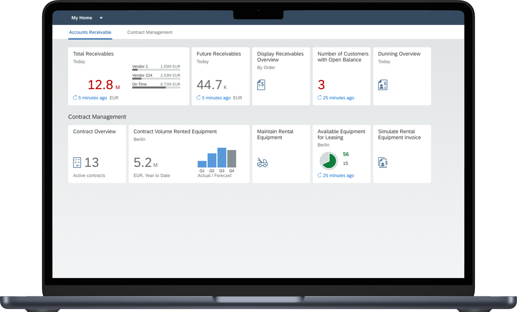
SAP Fiori Hi-Fi prototype - Home Dashboard
04

benefits

Redesigning for Clarity and Efficiency

Transformative: New Dashboard and Information Architecture

The redesign of the SAP Fiori application focused on two pivotal aspects: the creation of a new dashboard and the overhaul of the information architecture. Both redesigns aimed to streamline the user experience, enhance efficiency, and align with common mental models and user behaviors.

1. New dashboard: unified and intuitive overview

The new dashboard was designed to provide users with a comprehensive and intuitive overview of the Accounts Receivable/repair process. This interface consolidated critical information, previously scattered across multiple systems, into a single, coherent view.
Dashboards are widely recognized as central hubs of activity in many software applications. Users expect dashboards to provide at-a-glance insights and easy access to critical functions. The design leveraged these common mental models by ensuring that the most important information was prominently displayed and easily accessible. This alignment with user expectations enhanced usability and facilitated quicker decision-making.
SAP Fiori Hi-Fi prototype - Home Dashboard

Benefits of the new dashboard

real-time notifications
The dashboard features widgets that display real-time notifications and updates, ensuring users are immediately aware of any changes or urgent tasks.
status overviews
Users can quickly view the status of various Accounts Receivable/ repair processes, enabling them to prioritize tasks effectively.
easy filtering & searching
Advanced filtering and search functionalities allow users to locate specific repair requests or information swiftly, reducing the time spent navigating through data.

2. New information architecture: efficient navigation and task management

The new information architecture was designed to streamline the navigation, search, and management of repair processes. By restructuring how information was organized and accessed, the application significantly improved the user experience.
Information Architecture

Benefits resulting from the new Information Architecture

unified interface
All repair-related activities, from initiating a new repair process to viewing and editing existing ones, are accessible through a single interface. It eliminates the need to switch between multiple systems, reducing cognitive load and potential errors.
enhanced search capabilities
The information architecture includes robust search functionalities that allow users to quickly find specific repair processes. This is particularly beneficial for handling large volumes of data, where manual browsing would be inefficient.
clear navigation paths
Intuitive navigation paths make it easy for users to move between different sections of the application. Whether starting a new repair process or revisiting older files, users can do so with minimal clicks and confusion.
consistency and predictability
Consistent layout and labelling throughout the application ensure that users can predict where to find information, making the interface easier to learn and use.

Common contributing benefits

Both the dashboard and the new information architecture contribute to several overarching benefits
First, there is increased efficiency: By consolidating functions and information, the redesign reduces the time users spend on tasks, leading to significant productivity gains.
Second, there is reduced errors: A unified interface minimizes the chances of errors caused by switching between systems and manually transferring data.
Third, there is improved user satisfaction: A streamlined, user-friendly interface enhances the overall user experience, leading to higher satisfaction and greater adoption rates.
05

final designs

Showcasing the Refined Solution

Clear and organized content in a new UI

The final design of the Fiori application features a clean and intuitive interface, adhering to SAP's Fiori design language. While there were restrictions due to the predetermined core UI elements of Fiori, these constraints were leveraged to create a consistent and user-friendly experience.
Composition of multiple parts of SAP Fiori interfaces

New customized repair process

The redesigned dashboard consolidates multiple interfaces into one cohesive platform. It offers real-time notifications, status overviews, and advanced filtering and searching capabilities. Widgets display critical information at a glance, allowing users to prioritize tasks effectively and navigate the repair process with ease. The design's simplicity and clarity reduces cognitive load, enhancing overall efficiency and user satisfaction.
Laptop showing SAP Fiori Home Dashboard
Laptop showing an SAP Fiori Hi-Fi prototype - Display Receivables OverviewLaptop showing an SAP Fiori Hi-Fi prototype - Equipment Overview
06

retrospective

Lessons learned for the future

Plan, engage & advocate!

This project reinforced the importance of thorough user research, iterative design, and clear communication with stakeholders. It also highlighted the need for UX advocacy to ensure user-centered design practices are maintained throughout the project lifecycle.

Plan for extensive stakeholder research

The process of gathering insights from stakeholders can be lengthy. Proper planning and time allocation are crucial to accommodate this phase.

Engage "real" customers whenever possible

Relying solely on internal stakeholders can skew the understanding of actual user needs. Direct end-customer involvement provides more accurate and actionable insights.

Advocate for a structured design process

Emphasizing the importance of starting with low-fidelity prototypes and iterating based on feedback helps in creating well-thought-out solutions. It's essential to resist the pressure to jump directly to high-fidelity designs.